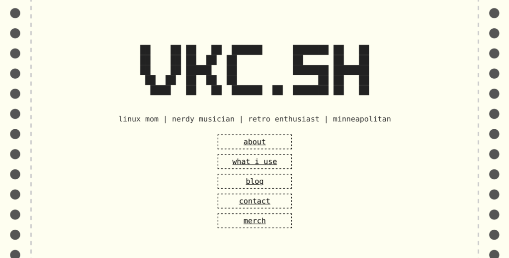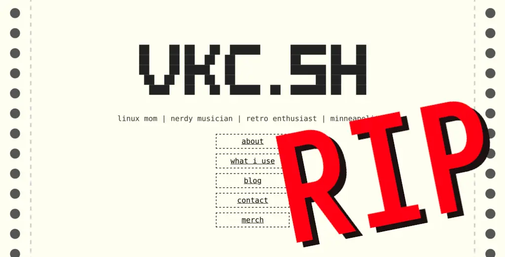
I loved this landing page. It was a quick and dirty CSS hack, and I enjoyed it greatly. However, I needed to make a change for a few reasons.
If you want to view the old landing page, I’ve memorialized it here.
x1000 brightness!
First off, as much as I enjoy the paper leitmotif, it is very bright compared with the rest of my page. Someday I might bring back this concept for a light mode/dark mode toggle!
I always felt like having the landing page be dramatically brighter than the rest of it felt like a wall, a “less inviting” entry into the website, or worse yet, an “invitation to go elsewhere”, even if the “elsewhere” was other places on the page. It felt like a different website.
If I’d made the rest of the website paper-bright, that would be one thing, but…
WooCommerce and CSS hacks don’t mix.
At the very least, they don’t mix well.
I tried a few times to add the paper border to elements of the WooCommerce parts of this site- the storefront. Unfortunately, I just couldn’t keep it consistent amongst browsers.
I’d already given up on round grippy-bits on the edge of the screen on Safari (they show up as squares), but my initial experimentation with expanding the paper was less-than-stellar on the store pages.
Of course, another aspect of this is the hack itself- relying on CSS hacks for layout can turn around and bite you when something in the spec changes. I wanted to get away from that, mostly.
(Of course, this website still uses a fair amount of CSS hackery but at least it’s consistent.)
Cohesion and simplification going forward!
Anyway, having a front page that looks drastically different than the rest makes for a less unified experience, and I wanted vkc.sh to be a good baseline for finding me and what I’m up to. The old landing page, as much as I loved it, wasn’t sending that message.
Maybe, if the blog is in the front page, I’ll blog more? I don’t know. I felt like I was hiding it before, and hiding it made me less likely to use it.
It’s like how I have to put my tools on pegboard. If they go in a drawer I forget I have them. With pegboard, I see them, and want to use them!
Other changes made
Anyway, the website is now simpler. One less thing to worry about. I got on a simplification kick last week when I modded the front page- I used Perfmatters to drop a bunch of the JavaScript from the non-storefront parts of the site. I also switched the photos to lazy loading- that should speed up loading time quite a bit.
I also dropped the Fira Sans font load from Google- your browser can pick a font and it’ll probably look OK. I still prefer Fira Sans in the CSS, though… so if you have it installed locally, you get the best possible view!
I made the decision to remove Yoast SEO from this page, too. I used it mainly to edit the metadata, but I decided to implement some quick & dirty metadata using GeneratePress Elements instead. Again, one less thing to worry about. Side note: I do really like the GeneratePress theme- it’s so flexible!
Lastly, and this one may be controversial- I dropped Plausible analytics from the page. I’m just not using the analytics for anything at this point, so why collect it? Basically, I was learning that when I talk about my website on YouTube or PeerTube or Mastodon, folks go to the website. I don’t need an extra service to tell me that. I still use them on customer websites, but you don’t need it here.
Thank you all!
You, dear reader, have made the last year of Veronica Explains very exciting, and this website is hopefully going to see more use beyond being a merch store in 2023. I have hope for some fun stuff like video companion pieces and so forth here.


Thanks for reading!
The written version of Veronica Explains is made possible by my Patrons and Ko-Fi members. This website has no ad revenue, and is powered by everyday readers like you. Sustaining membership starts at USD $2/month, and includes perks like a member-only Matrix/Discord space. Thank you for your support!